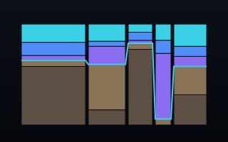
China makes a third of the world's electricity — mostly from coal
In 2024 the world generated 30,913 terawatt-hours of electricity. China made 10,087 of them — 32.6%, more than the United States, India and Russia combined. And 57.8% of China's power still came from coal.
Most charts of the energy transition answer one question at a time: who generates the most, or who is cleanest. A marimekko answers both at once — and the trade-off between them is the whole story.
Two numbers in one shape
In a marimekko, each country is a column whose width is its share of world generation and whose height is its fuel mix. So China isn't just the widest column — it's a wide column with a deep coal-brown base. The United States (14.2%) is the next widest, but gas-heavy rather than coal-heavy. India (6.6%) is small-but-blackening: 75% coal. A stacked bar could show the mix or the size; only this form shows how they interact.
World electricity generation by fuel, 2024. Open the interactive version → Source: Ember, yearly electricity data (CC BY 4.0).
The waterline
Running across all thirteen columns is a single glowing line marking where fossil fuels end and low-carbon sources begin. It's the chart's argument drawn as one stroke: it hugs the floor at France — 94.9% low-carbon, a violet nuclear pillar — and rides near the ceiling at India and Indonesia, where coal fills almost the whole column. China's waterline sits at 61%. Read left to right, it's a skyline of how much of each country's power is still smoke.
The world total, in two figures
Aggregate every column and the planet's grid is 34.1% coal against 15.0% wind and solar. Renewables are the fastest-growing slice — but coal is still more than double wind and solar combined, and the single biggest reason is the width of that first column.
Why the chart is built the way it is
Columns are ranked widest-first from the left, so the eye meets China immediately. The fuels stack dirty-to-clean from the bottom, which puts every country's coal on the same baseline and every country's clean crown at the top — and on the dark themes that crown glows, because electricity is light and coal is matte. A thirteenth column, "Rest of world," is computed as Ember's world total minus the twelve named columns, so every country on Earth is counted, not just the top twelve. And the label for each column is placed by a solver that nudges names apart and draws a hairline leader when a column is too thin to sit under — so nothing overlaps, even where the columns get slim.
What the data made us check
Ember's file is clean — the fuel groups sum to each column's total to 0.000% — but a marimekko is only honest if the parts really add up, so we verified it before drawing. Two framing choices are stated in the chart's notes: "gas & other fossil" folds oil in with gas, and "bio & other clean" groups bioenergy with other renewables. Generation (TWh) is the measure, not capacity — a country can have lots of solar panels and still run mostly on coal at night, and generation is what actually comes out of the grid.
What your data needs to look like
One row per column, a total, and the sub-values that make up that total. The agent computes every width and height as a share.
country
total_twh
coal_twh
gas_twh
wind_solar_twh
China
10087
5828
410
1836
United States
4391
652
1900
756
France
562
1
28
71
Novice tip: bring the raw amounts in one consistent unit — the agent turns them into widths (share of total) and heights (share within each column), and checks that your parts sum to your totals. Don't pre-compute percentages; a percentage can't tell the chart how wide a column should be.
The takeaway
The energy transition is usually argued in shares — "renewables hit a record." True, and this chart shows it. But it also shows the thing shares hide: the biggest lever on the world's carbon isn't the percentage on the newest solar farm, it's the width of one coal-based column. Size and cleanliness are different questions, and the honest answer needs both axes.