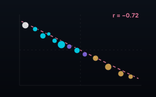
The longest-working countries produce the least per hour
Intuition says more hours means more output. Across 40 economies in the OECD's 2023 data, the relationship runs the other way: the correlation between annual hours worked and GDP per hour is r = −0.72. The countries grinding the longest years sit at the bottom of the productivity table.
Two OECD series, joined on the year they both cover all 40 economies: average annual hours actually worked per worker, and GDP per hour worked in purchasing-power dollars. Plot one against the other and the diagonal does the arguing.
The two corners
Colombia logged the longest working year in the file: 2,252 hours per worker, producing $21.3 per hour. Germany logged the shortest: 1,339 hours — 913 fewer — at $93.7 per hour, roughly 4.4 times Colombia's output rate. The pattern isn't two outliers: Mexico (2,228 h), Costa Rica (2,171 h) and Chile (1,953 h) fill the long-hours, low-output corner, while Norway (1,391 h, $132.3) and Denmark (1,374 h, $99.2) anchor the opposite one. End to end, the productivity span runs 7.2×.
The United States works long and produces a lot — 1,805 hours at $97.0, the clearest exception to the diagonal. South Korea (1,872 h, $54.6) and Greece (1,894 h, $44.9) work near-Colombian years for mid-table output. And Ireland tops the whole chart at $153.6 per hour — with an asterisk, because multinational profit booking inflates Irish GDP well beyond what happens in Irish workplaces. Luxembourg's $126.5 carries the same asterisk. The chart says so on its face, in the tooltip and in the notes, because a number that flatters deserves a flag, not a caption you have to hunt for.
What this is — and what it isn't
This is a co-movement, stated as one: longer working years go together with lower output per hour across countries. It is not a claim that cutting hours raises productivity — rich economies afford both shorter years and better capital, and the causality runs through everything from industry mix to investment. The chart states r = −0.72 and names the exceptions; it doesn't preach.
Why the chart is built the way it is
Every country is labelled — but never at the cost of overlap. A collision solver places each label in the first free spot around its dot and drops a label it can't place cleanly rather than shrinking it; the nine story countries are guaranteed a label at every screen size via hairline leader lines when their neighbourhoods crowd. Bubble area carries employment (the US bubble is 163 million people; Iceland's is 218 thousand), colour carries region, and the r-statistic sits on the axis row — outside the plot, because the bottom-right corner belongs to Colombia, not to a caption.
What the data made us check
The OECD publishes hours in two places — a dedicated labour series and inside its productivity database. We joined the first and cross-checked the second: median gap, 2 hours. The largest gaps (US 54 h, UK 28 h) are methodological, and the OECD itself flags cross-country hours levels as less comparable than trends — all stated in the chart's notes. 2023 is used because 2024 drops eight economies, including the US, Japan and Korea.
What your data needs to look like
One row per entity: the two variables you want related, an optional size variable, and a category for colour.
country
hours_per_worker
gdp_per_hour_usd
employed_k
region
Colombia
2252
21.3
22788
Americas
Germany
1339
93.7
46011
Europe
South Korea
1872
54.6
28416
Asia & Oceania
Novice tip: bring both variables in their natural units and let the agent compute the correlation, the trend line and the outlier callouts — never pre-rank or normalise. If some entities deserve a caveat (a distorted denominator, a definitional quirk), say so: the chart will carry an asterisk rather than hiding the problem.
The takeaway
Hours are an input. Output per hour is the economy. Forty countries on one diagonal say those are very different things — and the countries at the top of the hours table would like a word with anyone who still equates the two.