Birth feels like the least schedulable event there is. Yet shade every day of a year by how many babies arrived, and a work calendar appears — weekends empty out, holidays go quiet, and one superstitious date dips more than the rest.
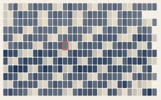
A calendar heatmap gives every day of the year its own cell and colours it by a value — here, the number of US births. Do that for 2014 and the eye finds the pattern before you read a single number: dark weekday blocks, and pale diagonal stripes cutting through them where the weekends fall. Babies, it turns out, mostly arrive Tuesday to Friday.
The 37% weekend gap
Across 2000–2014, an average weekday saw about 12,700 births; an average weekend day, barely 8,000 — a 37% drop, with Sunday the quietest day of the week. Newborns don't know it's Saturday, so this isn't biology. It is scheduling: a large share of American deliveries are inductions or cesareans, and those are booked into hospital hours, which means weekdays. The weekend stripes on the chart are the shadow of an appointment book.
US births by day, 2014. Open the interactive version → Source: US Social Security Administration via FiveThirtyEight (CC BY 4.0).
The days that go dark
The palest cells of all aren't weekends — they're holidays. Christmas is the quietest day of the year, averaging about 6,400 births, roughly half a busy Tuesday. New Year's Day, the Fourth of July, Labor Day and Thanksgiving all sink too. A hospital can't move a spontaneous labour, but it can decline to schedule one for December 25th — so the elective share of births simply isn't there on the days the country takes off.
And then there's Friday the 13th
Which brings us to the ringed cell. This dataset comes from FiveThirtyEight's look at whether people avoid giving birth on Friday the 13th — and gently, they do. A Friday is already a normal delivery day, but when one lands on the 13th, births run 5.3% below an ordinary Friday. The tell is that the 13th barely dips on other weekdays (under 2%); the effect concentrates on Fridays, where the two superstitions stack. It is the clearest sign in the whole chart that birth timing is partly a choice — a small, human thumb on the scale of when a scheduled baby arrives.
Why the chart is built the way it is
The grid is twelve month-rows by thirty-one day-columns, so every date has a fixed home and the weekend rhythm reads as a clean diagonal. Colour runs light-to-dark for few-to-many, the convention a calendar heatmap has taught everyone through years of contribution graphs — which is why it sits on a light canvas by default. Holidays are circled and Friday the 13th is ringed, but the quantified claims (the 37%, the 5.3%) are drawn from all fifteen years, not one, so a single noisy year can't carry them. The visible calendar is 2014; the statistics behind it are the long-run average.
What the data made us check
The honest hierarchy matters here. The headline temptation is Friday the 13th, but the data is emphatic that the big signal is the ordinary work week — the weekend gap dwarfs the superstition, and Christmas dwarfs both. So the chart leads with the schedule and keeps Friday the 13th as the hook, at its true size, rather than dressing a 5% curiosity up as the main event. One framing note we put on the chart: births are counted by calendar date, with no adjustment for the fact that a month can hold five Mondays but four Fridays.
What your data needs to look like
One row per day of a single year: the date and a number. The chart lays out the calendar and shades every cell.
date
weekday
value
2014-01-01
Wed
8018
2014-06-13
Fri
11651
2014-12-25
Thu
6749
Novice tip: a calendar heatmap wants exactly one value per day for one year — daily counts, prices, temperatures, sign-ups. If your series runs several years, pick one representative year to draw and compute any headline number across the whole span, so the picture stays crisp while the statistic stays robust. Mark the dates that carry meaning (holidays, a launch, an anniversary) and the chart will call them out.
The takeaway
We think of birth as the one thing that happens on its own time. At the scale of a whole country, a surprising amount of it happens on the hospital's time instead — clustered onto weekdays, thinned out on holidays, and nudged, just slightly, off Friday the 13th. The calendar of when we're born looks a lot like the calendar of when we work.