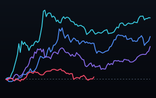
Bitcoin's block subsidy halves about every four years. It is the only clock the network keeps, and it makes the one honest way to compare Bitcoin's cycles with one another: start each on its own halving day, index it to 1x, and run it for the same length of time.
Same start, same length, one axis
Bitcoin charts usually run on a calendar, which makes the cycles impossible to compare — each one starts somewhere different and the last is always squashed against the right edge. Aligning them on their own halving day fixes that. Every line begins at 1×, follows the price for the four years after its halving as a multiple of what a coin cost that day, and is drawn on a log scale so a ×84 and a ×2 can share a frame without one of them becoming a flat line on the floor.
Measured this way the pattern is not subtle. The 2012 cycle peaked at ×84. The 2016 cycle at ×26. The 2020 cycle at ×7.9. Each one is roughly a third of the one before it — and you can read that off the chart without looking at a single number, because the lines simply stack lower.
The 2024 cycle is 29 months into its 48 and has reached ×1.9 so far. It is drawn in red at the bottom, still close to the ×1 line it started on.
The word "so far" is doing real work
Three of these cycles are finished. One is not. Comparing an unfinished cycle's peak with three completed ones as though it were final is the easy mistake this chart is built to avoid, so the current line is labelled peak ×1.9 so far, both on the chart and in its end label, and the notes say how much of its window is left to run.
The second caveat matters as much. Four cycles is four observations. The chart shows that each has returned less than the last. It does not show that the next one must, and it does not say why — no explanation is offered for the decay, because none can be supported by four points.
Why this replaced a cleverer chart
The first version of this was a connected scatter: price against on-chain transactions per day, tracing a decade as a path through two variables. It was accurate, and it was the wrong chart — two axes to decode, time hidden inside a squiggle, and a reader has to work before they learn anything. The finding underneath it was far simpler than the form was making it look. When the shape of the chart is harder than the shape of the idea, the chart is wrong.
What your data needs to look like
A date, a value, and the event dates you want to align on.
date
price_usd
2024-04-19
63507.69
2024-04-26
64481.71
2025-10-07
124776.68
Novice tip: this form works for anything with repeating episodes — product launches, funding rounds, election cycles, drug trials. The trick is that the alignment point has to be a real event in the data's own life, not a calendar boundary.
The takeaway
Indexing to a shared day zero is one of the cheapest and most under-used moves in charting. It costs nothing, it removes the calendar as a confound, and it turns four incomparable histories into one legible comparison.