Where 800 Airbus deliveries actually landed in 2025
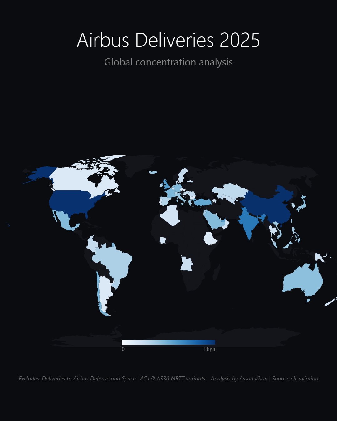
Fifty-nine countries took at least one new Airbus in 2025. Two of them — China and the United States — took a third of everything. Mapping the deliveries turns a production statistic into a geography of demand.
A single annual delivery total tells you how healthy the manufacturer is. Mapping the same deliveries tells you something more useful: whose aviation market is growing, right now, in physical aircraft rather than press-release orders. An order can slip for a decade. A delivery has a tail number and a customs record.
Airbus deliveries in 2025 by operator country — switchable between total, narrowbody and widebody. Open the interactive version → Source: ch-aviation.
The headline numbers
The map aggregates 800 delivered aircraft across 112 operators in 59 countries — 698 narrowbodies and 102 widebodies, a 7-to-1 ratio that says everything about where airline economics currently live. The country ranking: China with 133, the United States with 130, then a long step down to India at 59, with the UAE and the UK at 34 each.
One airline out-received entire continents
Drill into the operators and the sharpest fact appears: IndiGo alone took 56 aircraft — more than any country except the top three, and roughly one delivery a week. China's intake tells the opposite story: its 133 aircraft are spread across more than a dozen carriers, led by China Southern (45), China Eastern (28) and Air China (20). Same headline volume, completely different market structure — one concentrated bet versus a state-orchestrated portfolio.
And then there's Malta at 27 — not a tourism boom, but the registry effect: ACMI and leasing groups domicile fleets there, a reminder that on any operator-country map, some countries are markets and some are flags. It's also why the ACMI world deserves its own chart.
Why the chart is built the way it is
Delivery counts are a skewed distribution — two giants, a busy middle, and dozens of one-delivery countries. A linear colour ramp would make the map two dark blobs on a grey world. The heatmap uses a scale that keeps the middle readable, and the metric switcher (total / narrowbody / widebody) matters because the three maps genuinely disagree: the widebody map lights up the Gulf and East Asia while the narrowbody map is broader. Hover any country for its operator-level breakdown, so the aggregation never hides the detail.
What your data needs to look like
One row per country, plus the value you want mapped. Add extra columns for a split — say narrowbody vs widebody.
country
narrowbody
widebody
China
98
32
United States
110
41
India
74
6
Novice tip: plain country names or ISO codes are enough — the agent matches them to the map. You don't need coordinates, regions or a pre-built total; it geolocates and aggregates straight from the country column.
The takeaway
2025's Airbus deliveries draw a two-power world with an Indian ascent: China and the US absorb a third of production, India takes more than the next two countries combined, and the narrowbody outnumbers the widebody seven to one. If you want to know where aviation is growing, don't read the order announcements — read the delivery map.