An overtake is a crossing, not two rows on a leaderboard
A ranked leaderboard answers who is biggest. It is very bad at answering who overtook whom, because a change in order shows up as two unrelated rows moving in opposite directions. An alluvial answers the second question by making the movement itself the ink.
The same ten operators, drawn as movement
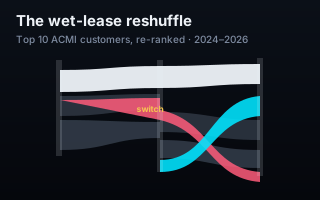
This is the companion to the ranked ACMI chart, on identical data. There, each customer is a bar and the width is flights operated. Here each is a ribbon whose width is the same number, and the stack re-ranks at every half-year — so when one operator passes another, the ribbons physically cross.
The clearest thing on the chart is a single airline group moving against itself. Qantas mainline sinks from 3rd to 10th, down 87%, while QantasLink climbs from 10th to 3rd, up 780%. On a leaderboard those are two rows several places apart and it takes a reader to notice they are related. As ribbons it is one X, and it is the first thing the eye finds.
That is the whole case for the form. Rank changes are relational, and relations are drawn, not listed.
When to use it and when not to
An alluvial earns its complexity when the order changes and the changes are connected. If the ranking is stable and you only want magnitudes, a ranked bar is clearer and cheaper to read. If there are more than a dozen or so entities, the ribbons braid into noise and nobody can follow a single strand. Ten is comfortable; twenty is not.
It is also worth being honest that this chart is harder to read than its companion. That is why both exist rather than one replacing the other — they answer different questions, and the notes on each point at the other.
What the chart does not claim
Flights operated is a count of activity, not of revenue, aircraft, or contract value. A crossing means one customer used more wet-leased flights than another in that half-year; it does not mean one is a bigger business. And the chart records the movement without explaining it — no reason is offered for why one carrier's flying moved to its stablemate, because the data shows only that both moved.
What your data needs to look like
One row per entity per period, with a value. The re-ranking is computed.
customer
period
flights
QantasLink
2024-H1
412
QantasLink
2026-H1
3625
Qantas
2024-H1
2980
Novice tip: three to six periods is the sweet spot. Two is a slope chart; a dozen is a line chart wearing a costume.
The takeaway
Choose the chart for the question, not for the dataset. The same ten numbers support a leaderboard and an alluvial, and the two are not interchangeable: one tells you the standings, the other tells you the race.