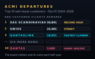
Wet-lease demand is a market of a few large customers whose order changes from one half-year to the next. Three half-years, ten operators, 395,831 flights. Drawn as a terminal departure board, the ranking is not a number you look up — it is a thing that clatters into place in front of you.
Why a departure board
Ten entities across three periods is small data. A grouped bar chart would fit it, and would answer "how big is each one?" perfectly well. But the interesting thing here is not the sizes — it is the order, and the fact that the order does not hold still. Fourth place in one half-year is tenth in the next.
A departure board is built for exactly that. Its rows are fixed positions and its content flips in place, so a change of rank reads as a change rather than as a redraw. The form also carries a remarks column without apology, which is where a chart of ten rows can afford to say what each row did in words.
The three half-years do not run in one direction. The top ten flew 118,081 flights in H1 2024, 149,114 in H1 2025 — up 26%, the peak of the window — then 128,636 in H1 2026, down 14% again. The market grew and then gave part of it back.
Underneath that, the order kept moving. SAS Scandinavian leads all three halves and finishes on 34,841, the single largest half-year on the board and 28% above where it started; it alone is 27% of the H1 2026 total. Two operators appear on the board for the first time in H1 2025 — Viva and QantasLink — and one of them, QantasLink, then climbs from 2,154 to 18,951, a rise of 780%, to reach third. Over the same half, Qantas falls from 19,926 to 2,660, down 87%, and lands at the bottom of the board.
What the chart deliberately does not say
Those last two movements are the obvious thing a reader will want explained, and the chart does not explain them. Qantas falling and QantasLink rising in the same half-year is a co-movement: the numbers move in opposite directions at the same time. That is what the data shows. Whether flying was reassigned between them, whether both changed for unrelated reasons, or whether a reporting boundary shifted, this dataset cannot tell you — it is a count of flights per operator per half-year and nothing else.
So the remarks column says DESCENDING and CLIMBING. It does not say "transferred". A chart that reads two adjacent numbers and infers a cause is doing something the data did not ask it to do, and the reader has no way to see that it happened.
Choices that had to be made carefully
Rows are fixed slots; only the content flips. The obvious animation is to slide rows up and down into their new rank. It looks impressive and it is much harder to read: the eye follows the motion instead of the value. Here rank 1 stays where rank 1 is and the letters change, which is what a real board does and what makes a change of order legible.
An operator with no service keeps its row. Viva and QantasLink have no H1 2024 flights. They are held on the board at the bottom, dimmed, showing NO SERVICE, rather than dropped and re-added. The ranking is over the same ten operators throughout, so the board is comparable across all three halves.
The trend bars share one scale across every row. Three small bars per row show that operator's three halves. They are scaled against the largest value anywhere on the board, not against each operator's own maximum — so a small operator's bars stay small. Per-row scaling would have made every row look equally dramatic.
The export waits for the flaps to land. A board mid-clatter is holding random characters. Both the PNG and the SVG settle every cell on its real glyph before the file is written, so an export taken during the animation is never a picture of gibberish.
What your data needs to look like
One row per entity, one column per period, in the order the periods happen.
operator
H1 2024
H1 2025
H1 2026
SAS Scandinavian
27294
29374
34841
Swiss
20079
22038
22401
QantasLink
0
2154
18951
Novice tip: a board wants eight to twelve rows. Fewer and a plain ranked bar says it in less ink; many more and the reader stops tracking positions and starts scanning for a name, which is a table's job rather than a board's.
The takeaway
Pick the form for the question. "How big is each one?" is a bar chart. "Who overtook whom, and what happened to the one that fell?" is a board — and the reason it works is that a fixed row with changing content is the only layout where a change of rank is something you watch rather than something you compute.